Pathwave Measurement Analytics
Test and Measurement is a long-drawn process integrating hardware for data gathering and digital software for data analysis and visualization into the mix. When software leads to frustration and takes a long time to get used to it, work performance suffers, and businesses slow down.
My role was to understand the design pitfalls of the software to develop innovative UI solutions driven by user insights and usability testing.
Team Collaborators
Rebeka Asryan (Product Design)
Kimia Mostadam (UX Research)
Tom Dai (Design Systems)
My Contribution
Ideation
Research
UI Design
Prototyping
Tools Used
Pen and Paper
Figma
FigJam
Maze
Project Timeline
April - Dec 2023
Problem
Keysight’s Pathwave software poses a serious problem to internal users due to its convoluted interface, causing confusion and decreased productivity, leading to an increased reliance on alternative tools.
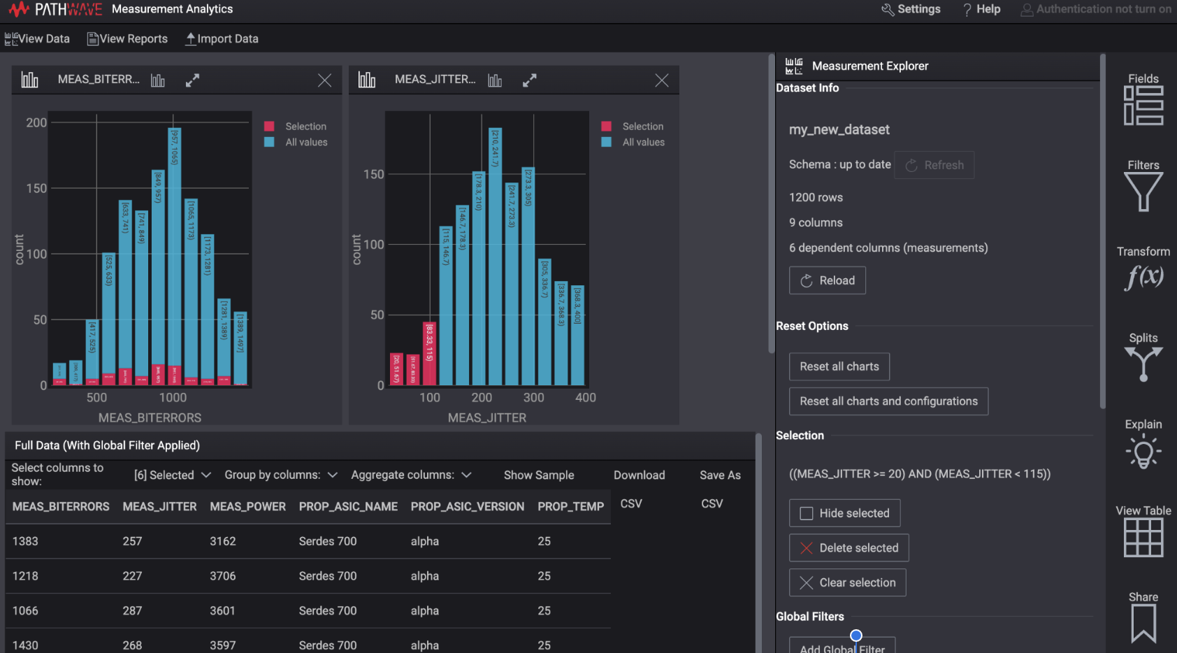
Pathwave Dashboard before redesign
Challenges: Nature of Product
Right from the beginning, our first intuition was to acknowledge our team skills and some of the challenging aspects of the project because Test and Measurement as an industry was new to us.
Need for the data visualization principles
A new area of research in the T&M industry
Different from other generic tools
Despite these challenges, our project journey was filled with new learnings and shared memories, which led to the following contribution.
Project Outcomes

The redesign of the software led to an improved user perception and quick turnaround of the user task flows.
A new navigation system helped redefine the site architecture, simplifying the users’ approach to recalling and recognizing the visual elements and content.
Overall Impact

Our high-fidelity prototypes were shipped and developed into the existing version by Keysight.
Our designs informed new dialogue between Keysight’s product and engineering teams, leading to a robust collaboration.
Our usability survey revealed that 63% of users found the new design structure better and more efficient for their tasks.
Deliverables: High-fidelity Wireframes
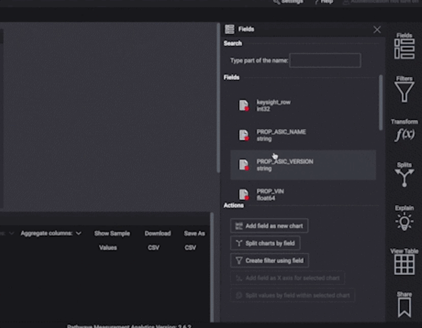
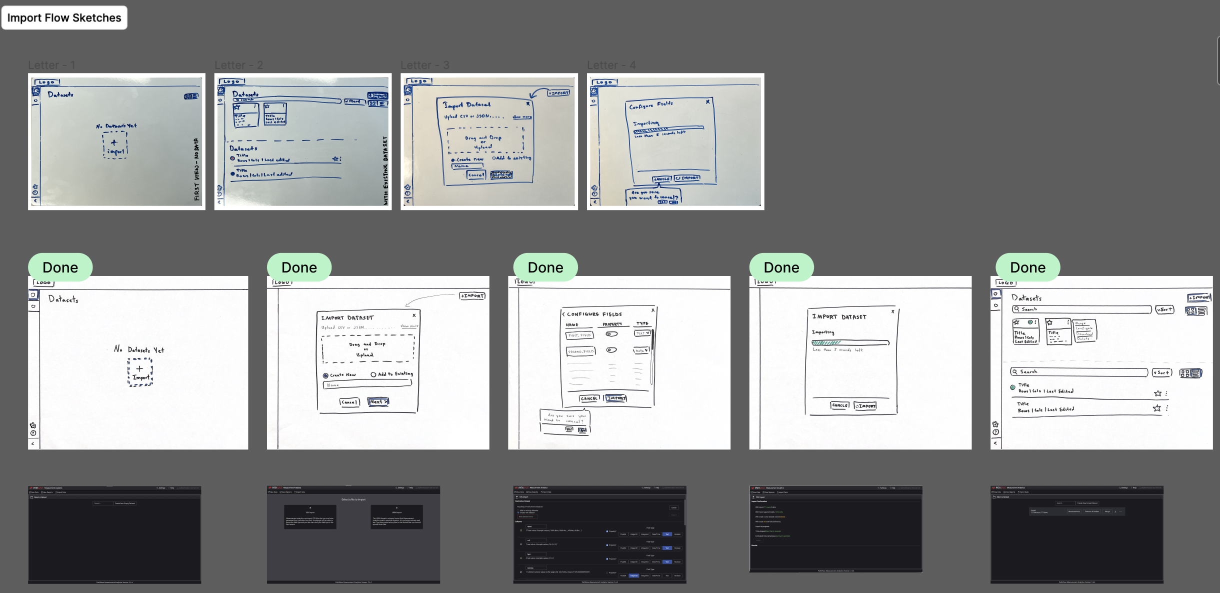
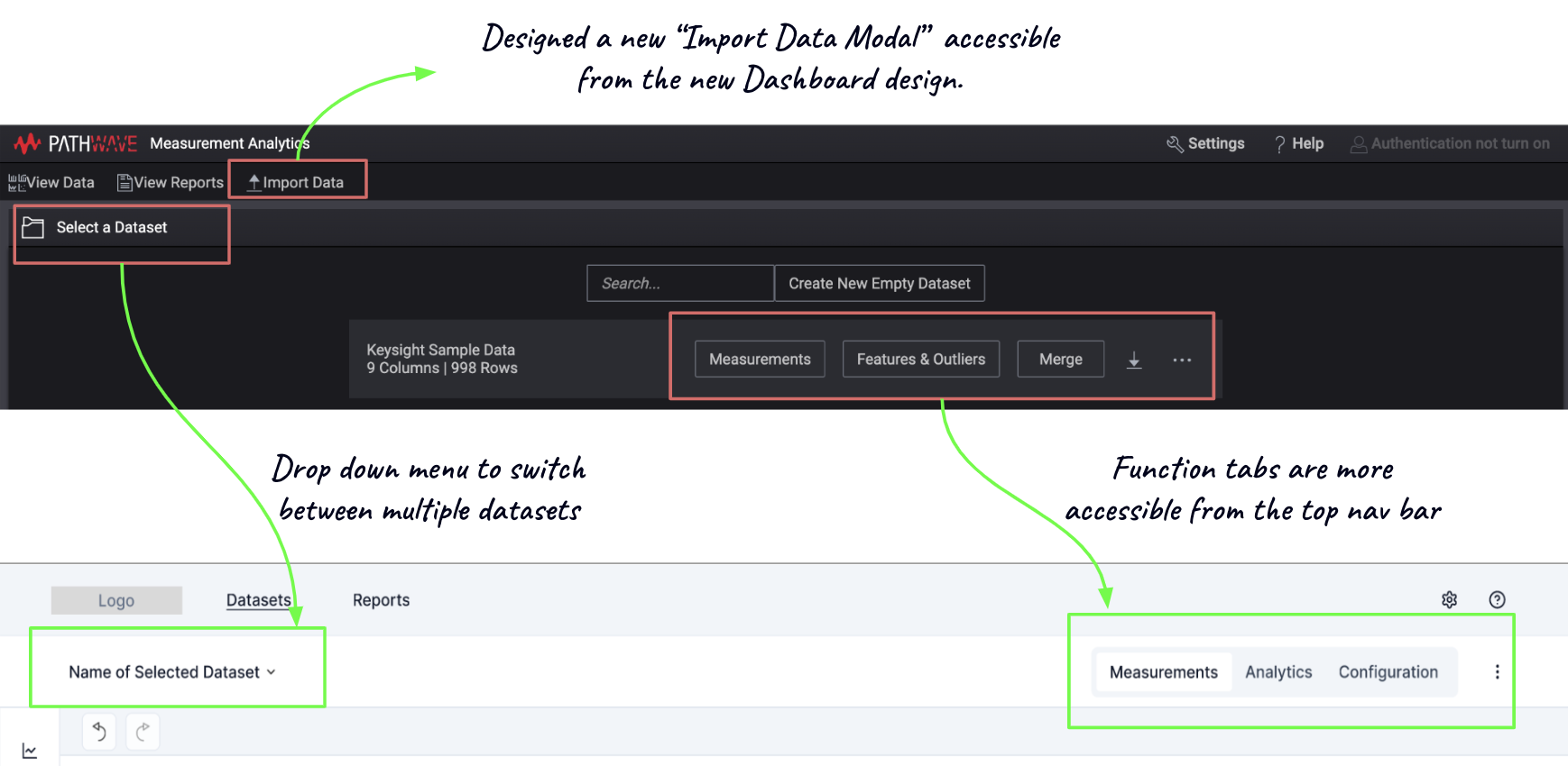
Enabling data import accessible for the new users
Before:
With no system directions, it took time to import data
After:
A new Import function with a clear “Import” CTA allows users to view data types and import raw data into the Pathwave.
Necessary system feedbacks, such as information dialogues, were added to inform users about the importing data status.
Viewing and Selecting multiple datatypes are faster and time-saving for the existing users.
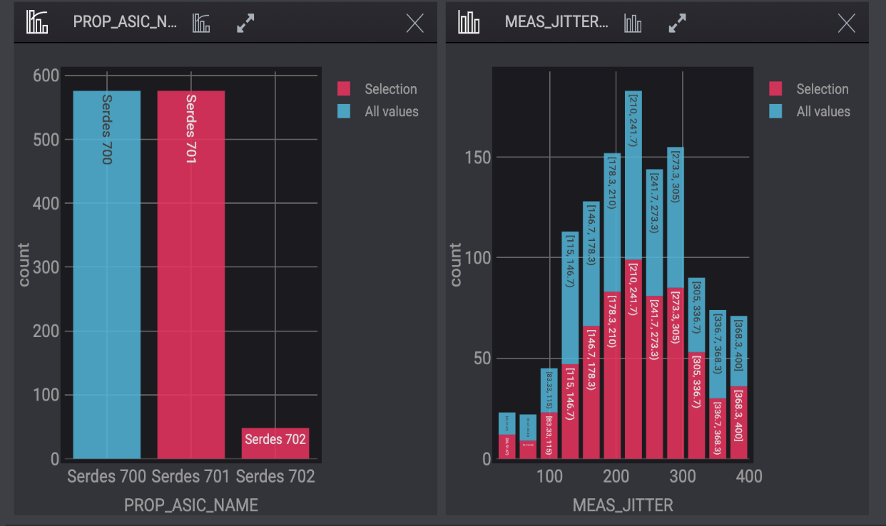
Separate functionalities:
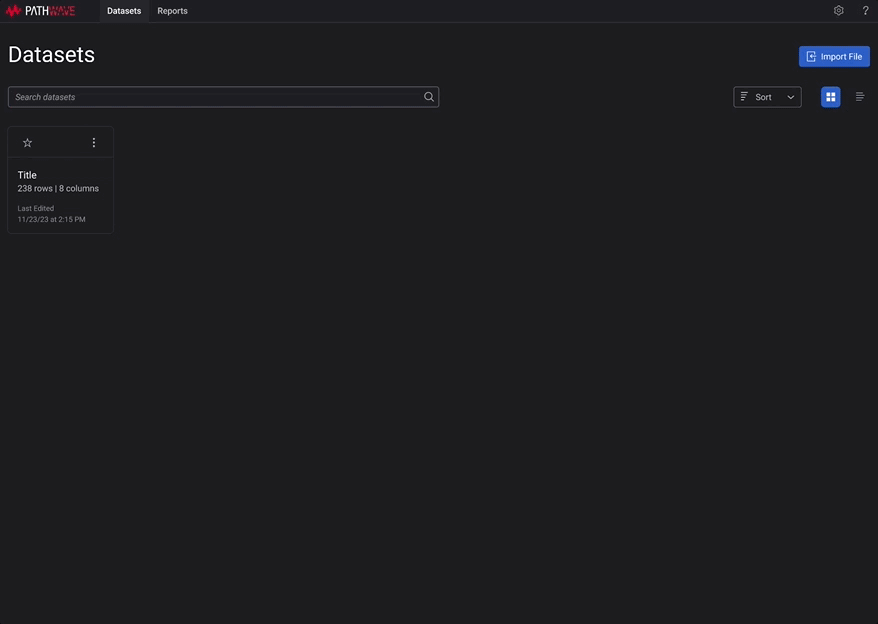
A new Dashboard informs users about the existing data sets.
A new side panel for navigation improved users’ filter-selection tasks.
How did we arrive at this new redesign?
Stages of User Research
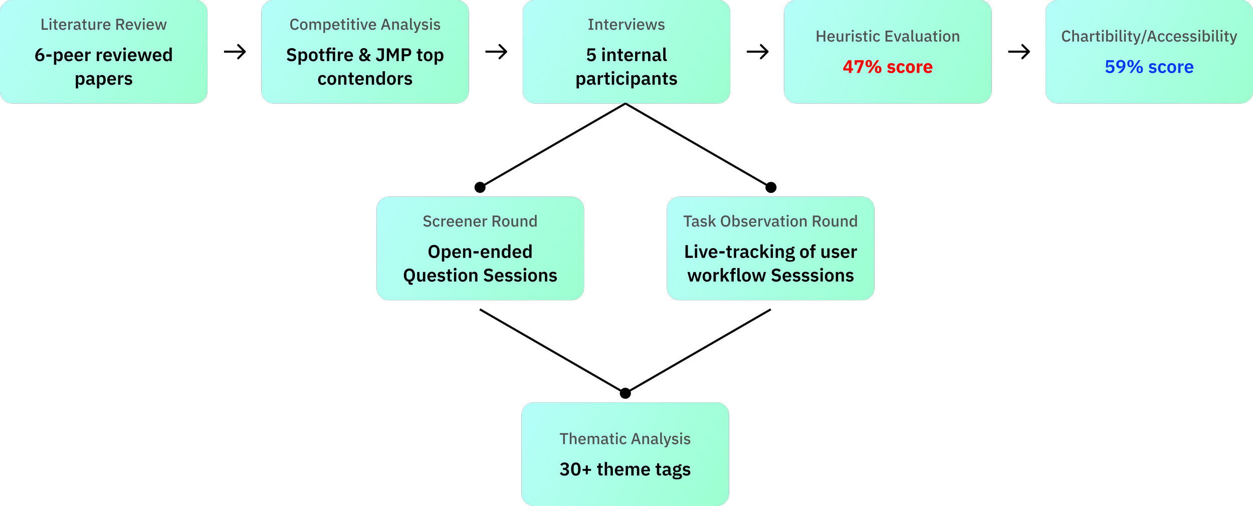
Primary Research Process
Interviews and Data Gathering
Recruited 5 internal participants and conducted 8 interview sessions
The group comprised of 1 Female and 4 Male participants.
The age range of the participants ranged from 22 - 42 years.
Test and Design Engineers and Data Scientists

Screener Round:
Objective: Uncovering user challenges.
Approach: Engaging with open-ended questions and active listening across 5 participants.
Task Flow Round:
Objective: Tracking live user flows and tool use cases.
Approach: Delving into task flow queries followed by real-time tool interactions with Pathwave, involving 3 participants.

Thematic Analysis
By pinpointing and highlighting themes with 30+ tags, we honed in on the most prevalent issues. These tags spanned every facet of the tool, addressing navigation challenges, task completion issues, design system intricacies, and UI elements. This comprehensive approach ensured that no aspect of the user experience was overlooked.
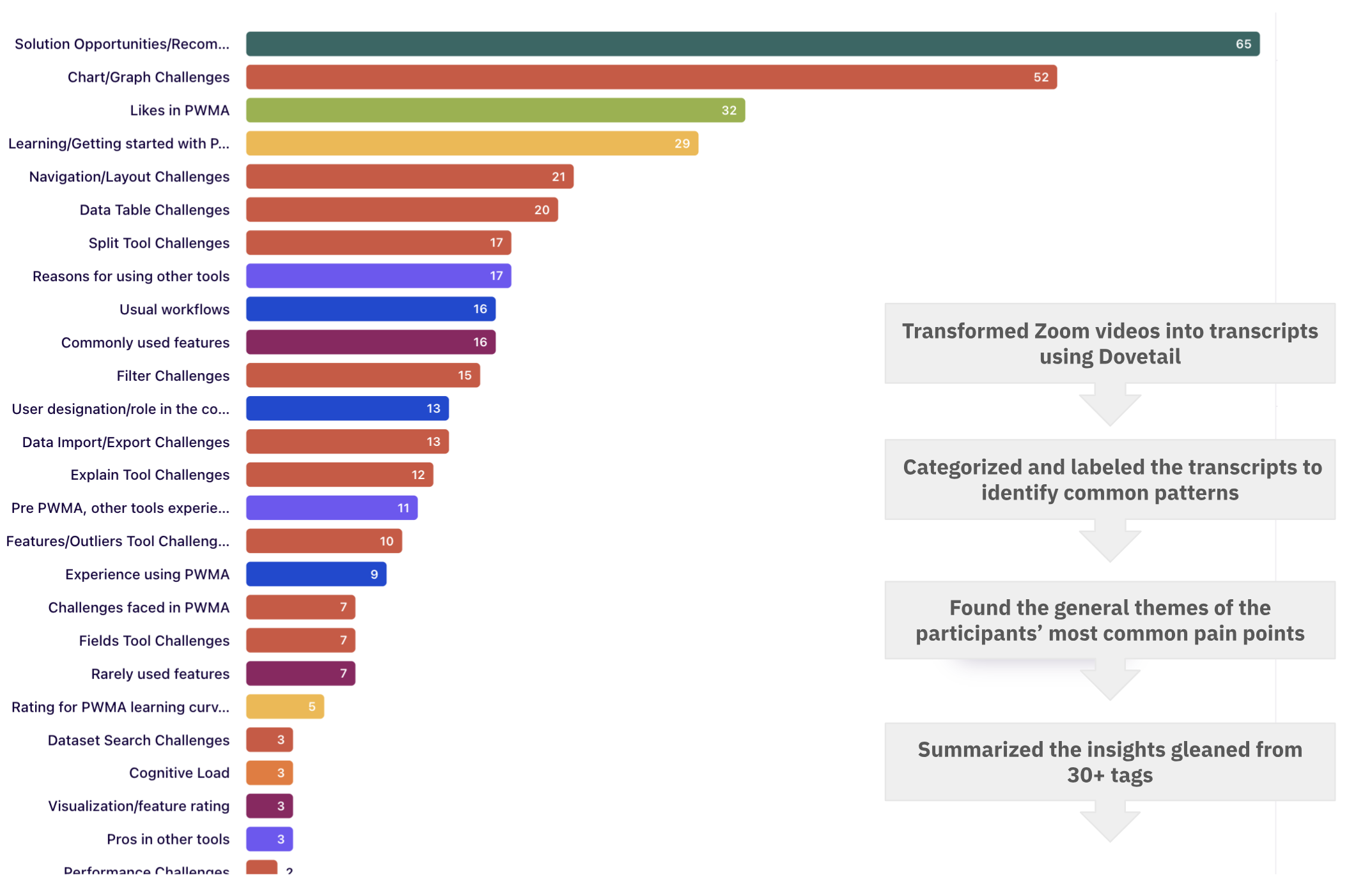
Interview insights summarized into 30+ tags in Dovetail
A Bird’s Eye view of the secondary research findings
Competitive Analysis Findings
6 direct and indirect competitors emerged as focal points for our analysis, and we subjected them to a comprehensive SWOT analysis.
Notably, Tibco’s Spotfire and Jmp Analytics were highlighted, as these tools were frequently employed by users for the initial stages of their workflow.
Click here to learn more about the detailed SWOT analysis worksheet.
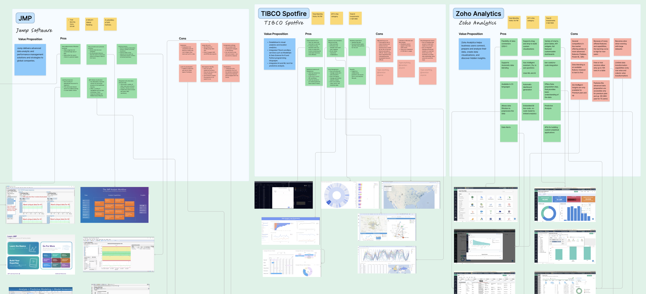
Feature Analysis of direct competitors
Heuristic Evaluation Findings
Considering the 10 heuristic criteria rooted in Nielsen's HE Principles, this process was executed by two team evaluators, employing a scoring scale ranging from 0 to 4, with each score indicating the severity of usability issues within the tool. The overall score was 1.9 out of 4 (48.5%).
Click here to view the detailed Heuristics Scoring Assessment.
Scoring Scale of Heuristic Evaluation
Chartibility Evaluation Findings
Pathwave was evaluated on seven criteria using a scale of 0 to 4, resulting in an overall score of 59%.
The evaluation unveiled common issues related to content representation, such as color contrast and font size, as well as the absence of user operation and settings control and affordances.
Click here to view the detailed Chartibility Scoring Assessment.
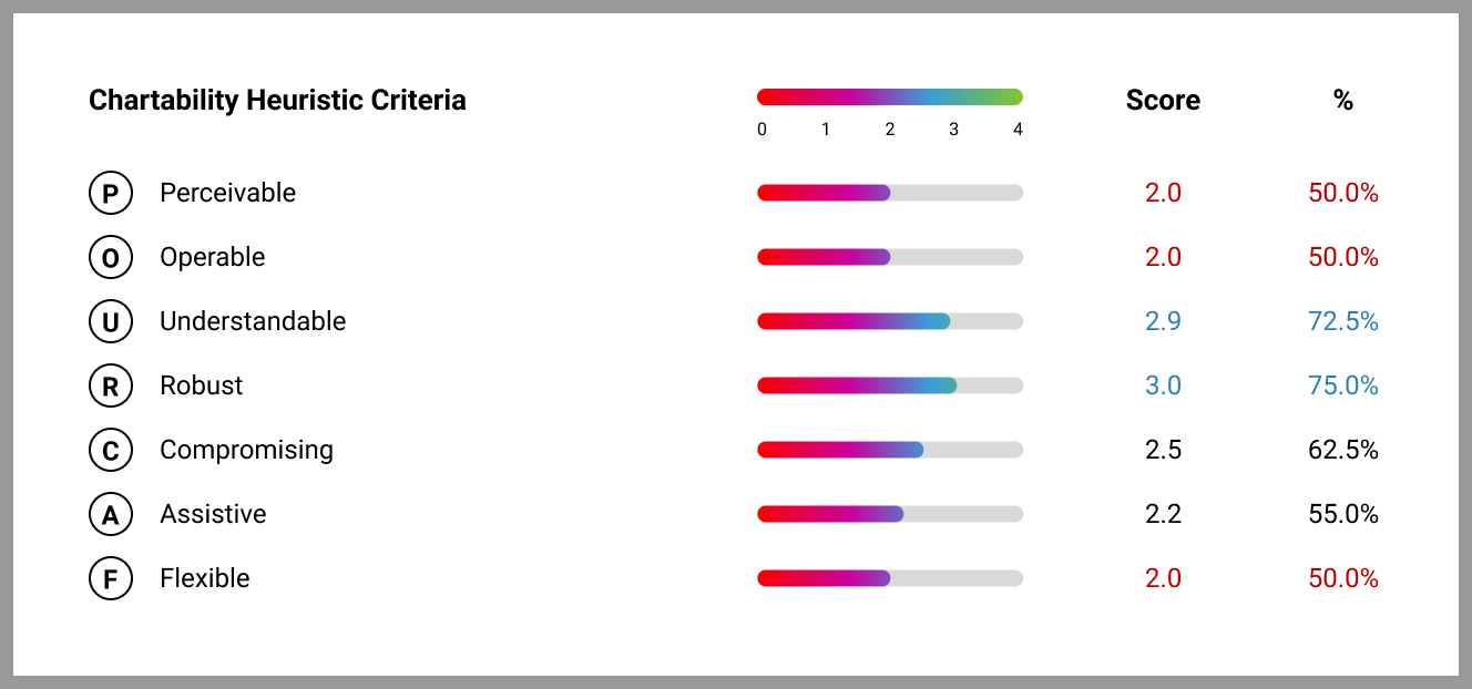
Scoring Scale of Chartibility Evaluation (a set of heuristics comprising questions aimed at ensuring the accessibility of data visualization systems.
User Insights: Pain Points
Feature-Specific Challenges
Complexity in performing quick tasks
Too many clicks needed to create charts
Lack of clear indications on the chart for applied filters
When a user was trying to create a scatter plot, they said, “There are too many steps to dig into… I mean, we need either training video or documentation to understand how to use the tool.”
Interface Challenges
Difficulty picking up certain aspects of UI.
Discrepancies between their intuition and the actual functionality of the interface.
When a user was showing us their mouse behavior, they said, “My experience says to me that when I click on the graph, the cursor here will be used as a selection tool, but instead of that, it works as the zoom cursor.
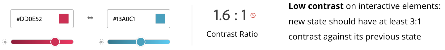
Accessibility Challenges discovered from Chartibility Assessment
No logical steps for performing the tasks.
The font size remains smaller than 12px in size.
There is a low contrast in interactive elements.
Design Process
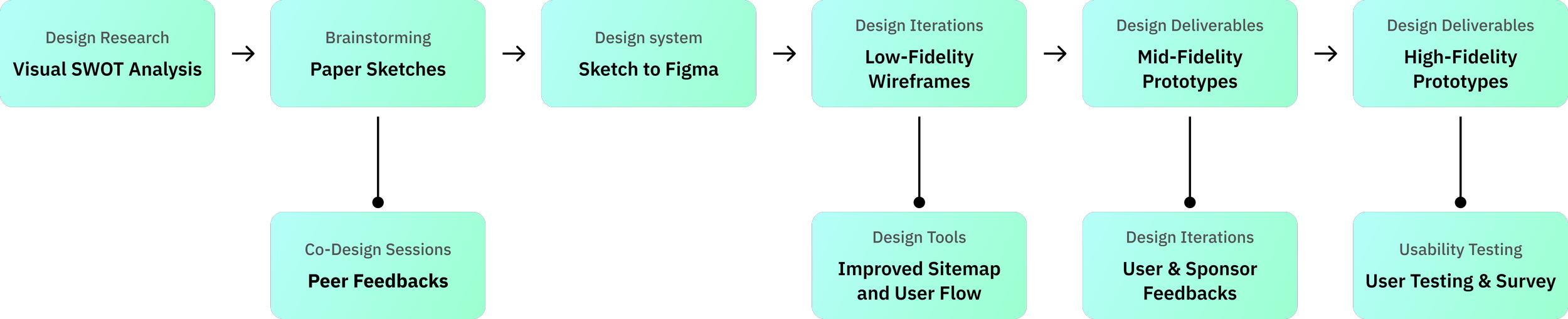
Brainstorming redesign solutions
The visual analysis of the old design
Conducted a visual analysis to capture the strengths, weaknesses, and design suggestions for the new redesign.
The visual analysis proved valuable for mapping the old navigation flow and identifying the underlying UI issues.
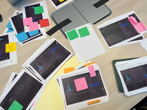
Paper and whiteboard sketches
Translated visual analysis into whiteboard and paper sketches.
These sketches were then employed in co-design sessions with external peers, providing valuable insights into common user preferences, biases, and mental models associated with general data visualization tools.
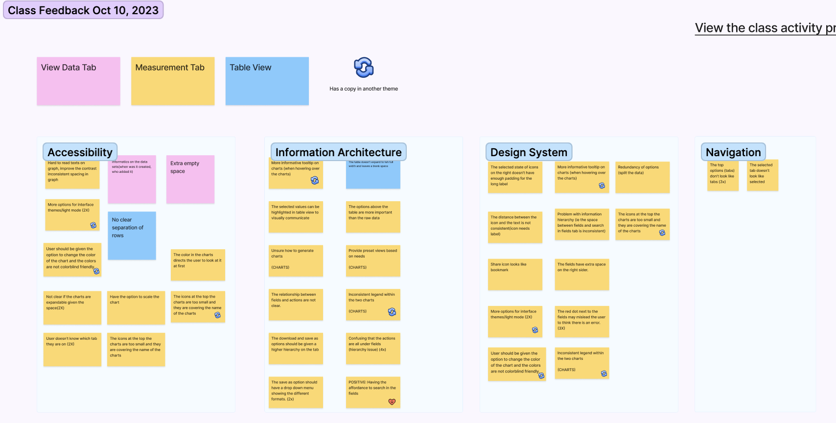
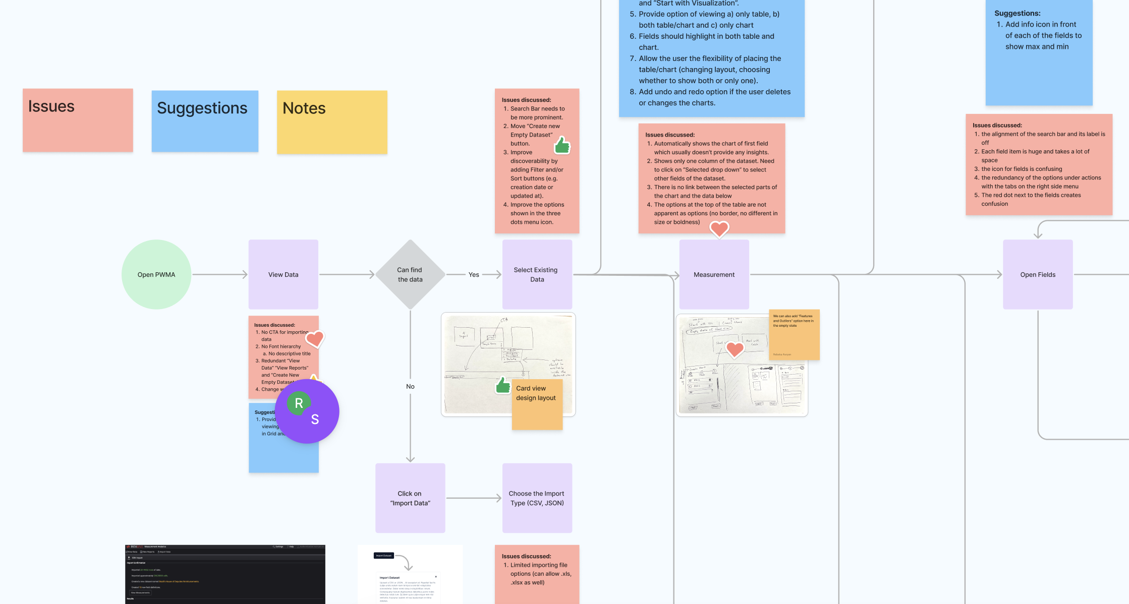
Cluster of Co-design session feedbacks
The feedback collected was distilled into four overarching design themes:
Accessibility, Information Architecture, Design System, and Navigation were high-level concerns identified in the project's initial phase.
Major Design Tweaks
Improved Navigation System: Top Bar
Problem: The user was unable to choose options for a single dataset, for instance, whether to open the “Measurement Tab” or “Analytics Tab.”
Solution: The option to switch between different tabs right from the dataset page without the need to go back and forth to do that. This recommendation helps to simplify task completion by removing a few extra steps from the user flow.
Improved Navigation System: Side Panel
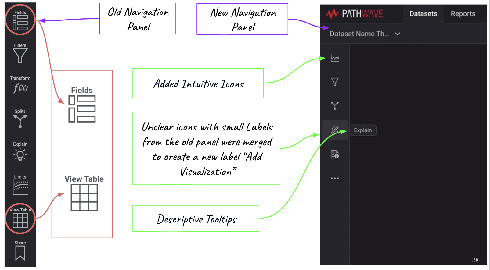
Problem: Lack of spacing and alignment between icons and font and redundant icon functions created confusion.
Solution: Combined “Fields” and “View Table” actions to label it as “Add visualizations, suggesting the use of intuitive icons and adding a tooltip for labels.
Problem: The user may not know the types of fields in the data.
Solution: Auto-filled fields allow the user to select the field before chart creation.
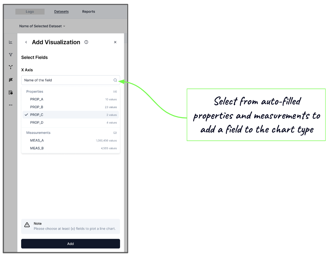
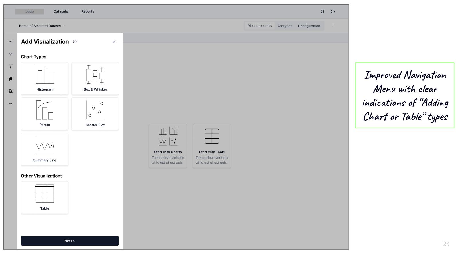
Problem: The user found chart creation unintuitive and hard to learn because of unclear system feedback and redundant navigation side panel.
Solution: Provided the option to first select the chart or table type based on the known properties of the data, thus simplifying the key task of adding visualization to the workspace.
A New Dashboard
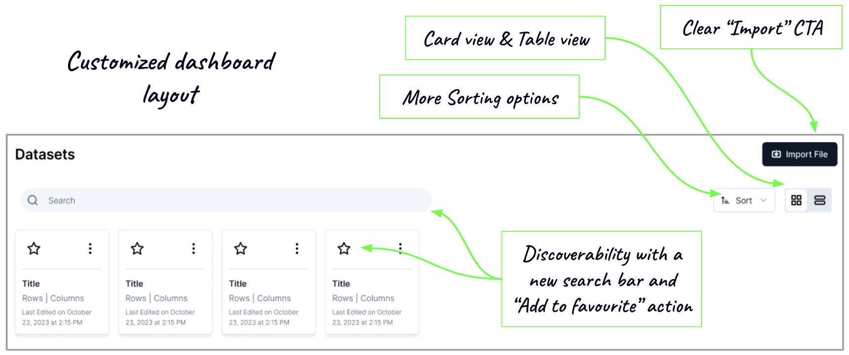
Problem: The user has to give time and effort to navigate Pathwave’s complex structure and identify/search different data types.
Solution: The modifications of the layout lead to a customizable dashboard and add familiarity.
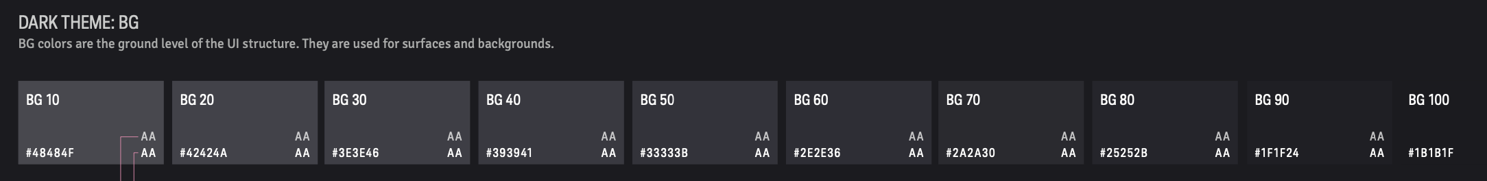
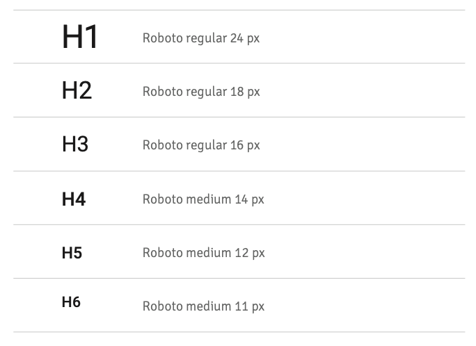
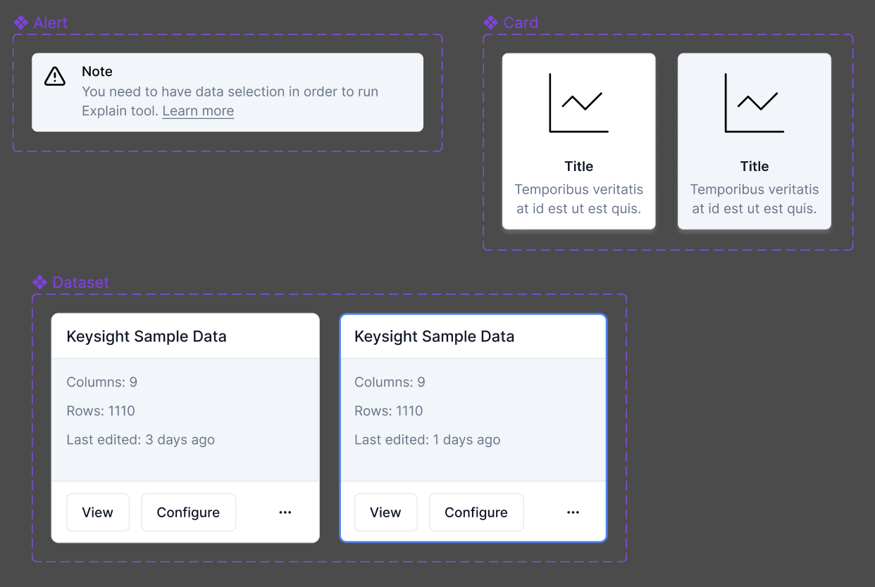
Design System
Mid-Fidelity Prototype
User Testing
We gathered user feedback on each stage of our design iterations. These iterations were made on the mid-fidelity prototypes, covering the challenges of navigation and chart creation.
The final round of user testing was conducted on the high-fidelity prototype that necessitated testers to follow a specific task flow: Import data, Create a field, Add a table and filter, Create a chart and Explain the selection
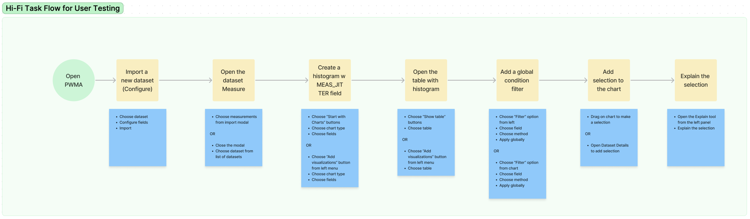
The task flow provided to the testers for the final round of user testing

With Maze, a research and testing tool, we gathered insights from 7 testers via heatmaps to understand their behavior in completing the task flow.
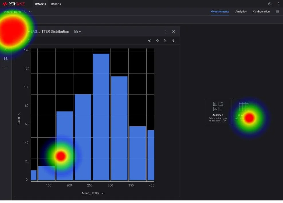
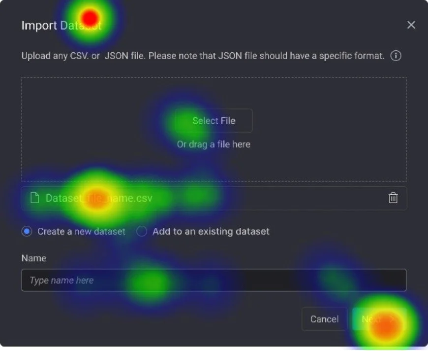
Heat maps of Import and Chart creation tasks of 1 test taker

Alex is a Test Engineer at Keysight. He feels more productive with the new Pathwave design.

I really like the (new navigation) because now there is not an additional step to go back to view the datasets.
Test Results
We found that testers found the navigation efficient for their task flow.
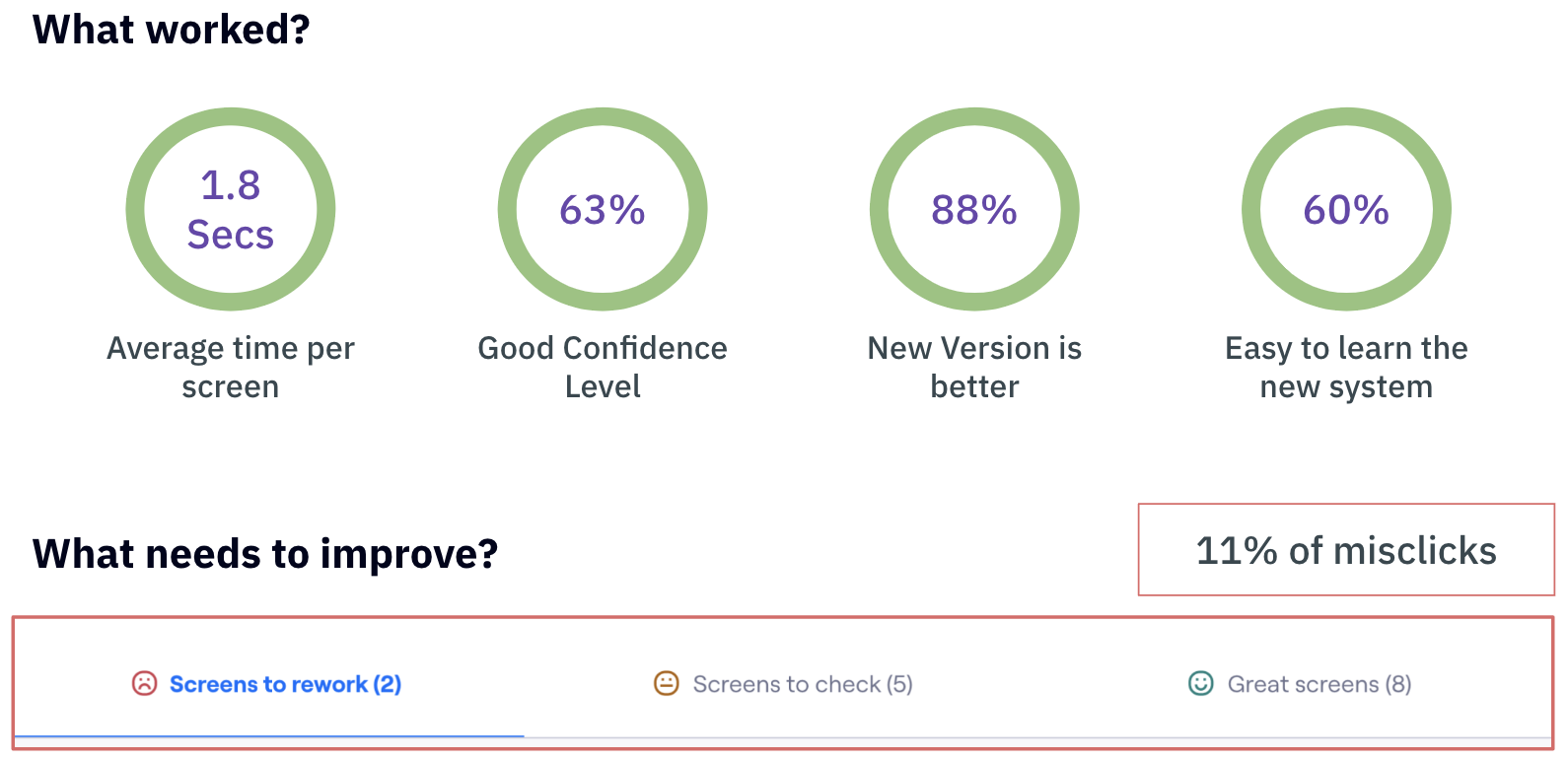
The results from Maze user testing
Reflections
One of the most important things that I learned was to like the blockers instead of nagging about them.
Time, resources, sample size, and component conversions were all challenging, but they taught me how to compromise, be cautious, delegate my work, and ultimately become a better designer.
Collaboration is crucial.
The design journey became easier with time because of the different skills each of us brought to the table.
More feedback leads to more confidence.
We developed a checks and balances system by asking questions, showing design frameworks, and developing skills to improve our work.