Rani - Seekho Aur Kamao
In the bustling city of Mumbai, where opportunities often seem out of reach for women from low-income families, the Myna Mahila Foundation has embarked on a mission to bridge the digital divide.
Their weapon of choice? The Rani app (Learn and Earn) – is a platform designed to empower women by providing access to digital skills and income-earning opportunities.
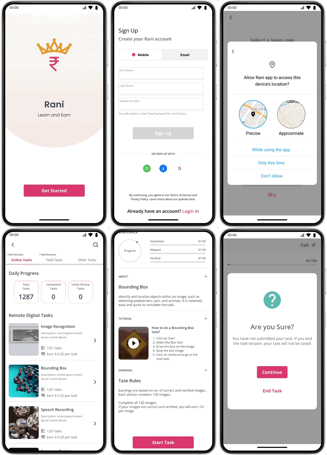
I worked on this project to enhance the design and layout of the Rani app and provided 20+ UI screens of improved designs.
Overview
Problem Statement
Outcome and Impact
Prototype
Context Building
UX Review
Design Process
Limitations and Reflections
Collaborators
Suhani Jalota (Team Head)
Tanvi (Team Manager)
Role
Brainstorming
User Navigation
UI Design
Tools
Fig Jam
Figma
Timeline
July 2023
2 Weeks
Problem
According to the Myna Mahila Foundation, today's job marketplace does not harness the full potential of women and girls. India's future lies in digital literacy, but for many women, especially those from marginalized backgrounds, access to such skills remains elusive. This challenge is compounded by a disconnect between digital literacy and employment opportunities.
The question was clear:
How can we create a platform that not only educates but also empowers women to earn a livelihood?
My Challenge
The existing app faced functionality issues, and the project framework was mired in ambiguity. The challenge at hand was to fulfill the team's demand for a redesign, utilizing anecdotal insights from the app's current users.
Project Outcomes
The project prompted the team to conduct user research and establish a strategic framework for various app aspects, including demographics, types of digital tasks, and prioritizing content architecture and UI design elements.
Overall Impact
One of the project's standout successes was the adoption of the new Homepage and Task screens into Myna’s Telehealth app for women.
The revamped design proved instrumental in securing funding opportunities for future app development.
Deliverables: Mid-Fidelity Wireframes
Women-only App
A safe and inclusive space for women to learn and earn.
Micro-tasking platform:
Opportunities to earn income through simple micro-tasks under “Earn” feature.
Understanding the Context
In the initial phase, I scheduled meetings with the team to understand the core functionality of the application. Given my limited engagement and time constraints, I started with two important questions.
What level of design changes does the team require in the app?
The following aspects of the app were prioritized.
01
Onboarding Experience
Homepage Layout
Navigation Structure
Who is the target audience?
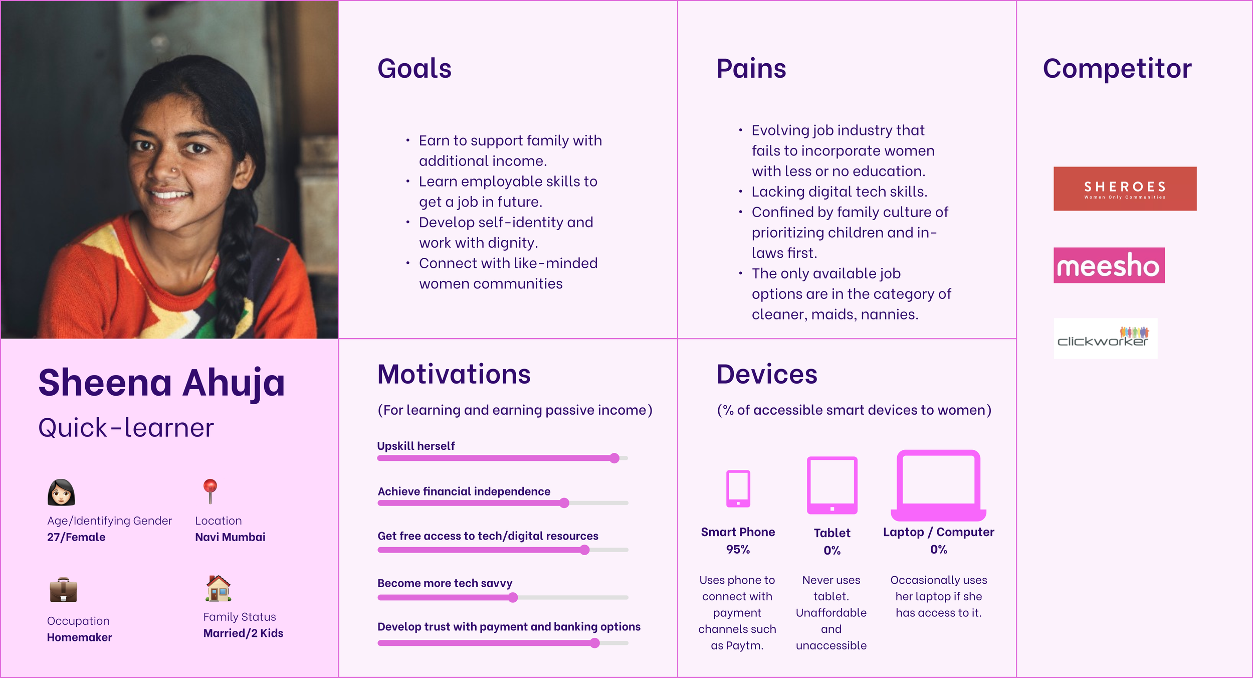
I learned that the current app users comprised Myna employees, their friends, and family. Additionally, the team shared valuable insights into users' backgrounds, occupations, employment status, and details about competitors.
Armed with this information, I created a persona to delineate user challenges, motivations, and pain points of the ideal user type.
02
User Persona
UX Review with Stakeholders
My initial project goals were to understand the usability concerns of the existing application and identify areas requiring redesign.
I did a thorough review of the existing design to point out major issues, which included unclear navigation flow and lack of affordances to guide the user to the next task.
The two primary Call-to-Actions are redundant and cause confusion for the users.
The missing navigation bars and no back/exit buttons lead to a high bounce rate in the app.
The lack of visual hierarchy with no clear navigation goal highlights users’ frustration.
Refining the Navigation with User Flows
The app review brought to light two critical issues.
First, the app's navigation needed to be fixed.
Second, the app design leaned heavily towards accommodating stakeholder needs rather than prioritizing user needs.
In response, I created a fundamental app flow, fostering a productive brainstorming session with the team. It became evident that the onboarding process was a significant bottleneck in the user flow.
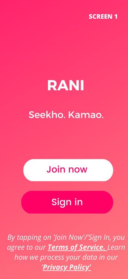
Ensuring the privacy of women was a top priority. Recognizing that only some women could comfortably use their mobile numbers for sign-up, our attention shifted to offering mobile and email login options. This approach aimed to eliminate potential barriers that could dissuade women from utilizing the app.
Basic User Flow with a focus on the onboarding process. Click here to view the complete flow.
Exploring design layouts for the Homepage
I presented the team with three homepage layouts aligned with their vision for the app and its functions. Guiding the team through these layouts, we evaluated the feasibility of the design in the absence of a solid foundation for the app structure and specific user data points.
Not Viable
Objective: Create a leaderboard for a gamified learning experience for the users.
Why: Streaks and Rewards are often motivational reminders for the users to resume tasks and improve on their activities
Problem: User engagement in a social setup was still in its ideation phase. We. were figuring out how the women would connect with other women in the app. Discussion boards / A social networking feature were some ideas.
Viable
Objective: Create a user statistics dashboard highlighting their process and earnings.
Why?: Progress info will help retain user engagement and push for external motivation to resume tasks/courses.
Problem: Data points for user statistics based on learning and earning actions of the user.
Viable
Objective: Keep the old layout with a logical app architecture.
Why?: There was a clear sense of goal with respect to creating the “Learn” and “Earn” features.
Problem?: The course content and course framework and “Connect” feature was still in its ideation phase.
Putting discussions into wireframes
After establishing viable options for the homepage, the next step was to translate them into tangible design elements. Low-fidelity wireframes allowed us to focus on the details, mapping out the exact placement of buttons, navigation elements, and content areas.
Low-fidelity Wireframes. Click here to view them.
As soon as the team approved the basic wireframes, I moved forward to work on refining the screens.
Design iterations on low-fi wireframes. Click here to view them.
Design System
I created reusable Figma components to increase the design process and developed a color palette similar to Myna’s brand colors.
Navigation Bars and Search Bars
Font and Color
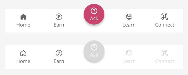
The bottom Nav Bar introduced a new “Ask” Chatbot feature
Tabs
Buttons
Going back to Square One
Our iterative design work on low and mid-fidelity wireframes resulted in a refined workflow experience. These iterations ensured that the design met stakeholders’ standards and resonated with the app's mission of empowering women through digital skills.
However, at a later stage of the project, the team realized that the old format of the app was more suited to the users' mental models.
Based on the users' anecdotal views of the app, it was essential to display the core features of the app first. So, we decided to choose Option 3 as the most viable Homepage Layout because:
The users were already familiar with the digital tasks offered by the app.
The "Earned" task content was already in its development phase.
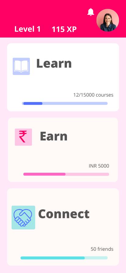
Merged Design Options 2 and 3 into a new layout
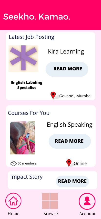
Old Design
New Design
In the new app design, the aim was to increase the discoverability of the navigation for the users.
The icons were intentionally used to drive tasks for setting the location, reading the notifications, and leading the user to the next page.
Previously, in the old design, the “Learn” and “Connect” pages were left blank as it was not implemented in the app. The team wanted to provide the users with a glimpse of the “Learn” and “Connect” sections. In the new design, these sections were disabled, supporting the team’s requirements but also signifying the users of its status.
But, a few aspects from Option 2 Homepage layout were added:
The Daily Progress Info served the purpose of keeping users informed about their tasks.
The new navigation tabs allowed users to easily switch between Remote tasks and Field tasks.
The team tested a new “Ask” chatbot feature and its placement in the bottom navigation bar.
The online jobs and course learning were separated into the respective sections under the “Learn and “Earn” pages.
Introduced a Chatbot feature in the bottom Nav Bar to test its functionality with the users in the future.
Final Screens
Learnings
Ambiguous nature of the project
I encountered significant ambiguity as the team was still shaping the app's direction. In those uncertain moments, I embraced the challenge, drew inspiration, and utilized my accumulated knowledge to chart a course forward.
Changing nature of my work
While the team and I initially settled on various designs, the ultimate shift in the project's goal—to create an MVP for funding—prompted a reassessment. We revisited and incorporated elements from the original design structure.
Lack of time
My involvement in the project was brief, and understanding the intricacies of the project proved to be a continuous process, emphasizing the need for patience and time investment to arrive at comprehensive and practical solutions.
Recognizing the Impact of User Data
Without substantial user research, I grappled with a perceived lack of skills to design an impactful application. Acknowledging potential biases in my decisions, I realized the need for continuous improvement. The experience taught me that committing to user-centric design is always possible.

